NatWest International
The Brief
The Brief was to re-think the International Payment user journey whilst adapting their new styling to each screen and component, throughout
Intro
I was hired on behalf of Sapitent to work on Natwests newly re-designed app. I focused on leading the design and enhancement of existing user journeys within the app, while managing, building, and maintaining a new design system, transitioning it from Sketch to Figma.
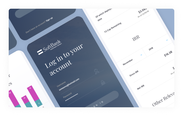
Client
Something here
Client
Something here
Client
Something here
Client
Something here
Client
Something here
Discovery
A series of workshops were held with designers, stakeholders and developers that helped me identify what was possible both from a design and development front. Ideas were brought to the table for me to figure out the quickest and easiest way for the user to make an international payment.
Pain Points
The existing user journey was overly complex, requiring multiple steps and ultimately redirecting users away from the app to the desktop site to complete their transaction.
It was crucial to keep the user in the app whilst containing each step to as few steps/screens as possible. New components and functionality were designed to make this a reality.
The UI
With the user flow in place, I began crafting each frame. While leveraging core components from the design system, I also designed new components and variations of existing ones to ensure a smoother, more intuitive user journey.
With the new design system already under development, I was able to delve straight into the high-fidelity UI designs.
01.
I began by selecting existing screens, templates and components from the design system that I felt were a good fit for this journey.
02.
I maintain clean, well-structured design files, organising frames in the exact order they appear in the app journey. This approach streamlines collaboration and makes the prototyping phase significantly easier.
03.
Throughout the design process, I keep stakeholders and developers closely informed by holding regular catch-up meetings. This helps manage stakeholder expectations and addresses any questions promptly.
I also ensure developers are up-to-date by introducing new components I’ve created, confirming their feasibility from a technical perspective
04.
The design system and various templates are always to hand on a separate monitor to ensure spacing and styling are always consistent throughout the journey.

Protyping & Testing
01.
Once complete, I used Figma to prototype the entire journey.
02.
I used Maze, a user testing platform, to gather feedback from both random users and stakeholders.
03.
I conducted multiple tests to gain insights into how different users navigate the journey.
04.
I conducted multiple tests to gain insights into how different users navigate the journey, allowing me to spot pain points and identify where users faced difficulties at various stages.